SaaS Landing Pages
SaaS Landing Pages
from €148,70
Sign-up pages, feature pages, and pricing pages for software companies. We know how SaaS visitors think because we have worked with about 40 of them.
Sign-up pages, feature pages, and pricing pages for software companies. We know how SaaS visitors think because we have worked with about 40 of them.
SaaS landing pages are tricky because your visitors are usually comparing you against two or three other tools at the same time. You have maybe 8 seconds to make your case before they switch to the next browser tab. That is not a lot of time for subtlety.
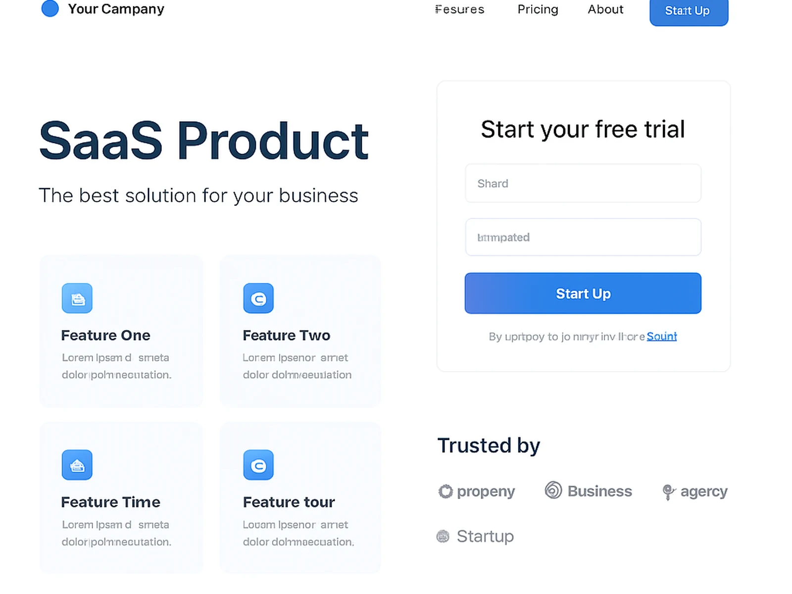
The headline needs to say what the product does in plain language. Not what it enables or transforms. Just what it does. Below that, a screenshot or short demo video. Then three or four benefits, not features. Social proof from recognizable companies if you have it. Pricing if you are transparent about it. And a signup button that is impossible to miss.
For SaaS pages specifically, what is visible before scrolling accounts for about 60% of conversions. We spend a disproportionate amount of time on that first screen. The headline, the subheadline, the hero image, and the primary CTA all need to work together as one unit. If someone reads just that section and nothing else, they should understand what you sell and why they should care.
Pricing pages are their own discipline. Too many options and people freeze. Not enough information and they leave to go comparison shopping. We usually recommend three plans, with the middle one slightly emphasized. Feature tables work for technical buyers, but most people just want to know which plan is for them.
Online · Navarra